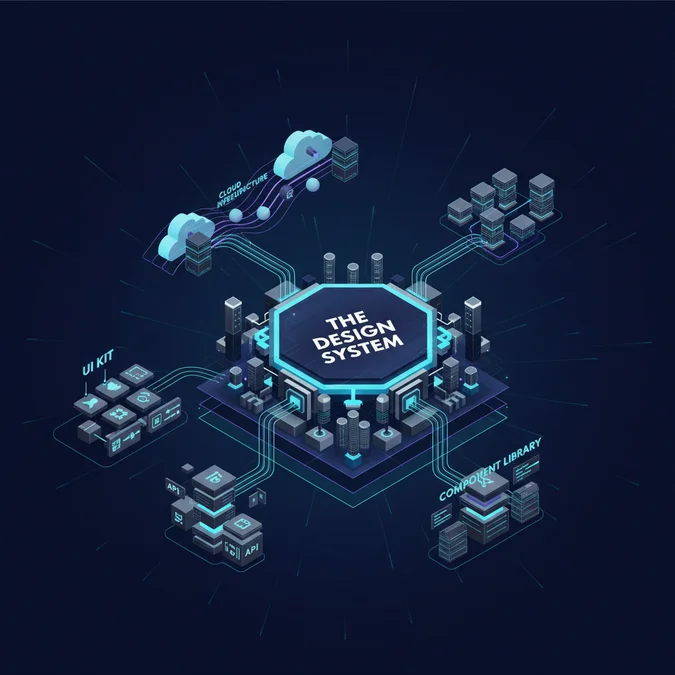

A design system is an enterprise infrastructure platform that synchronizes product design decisions with version-controlled production code across an entire organization. Rather than functioning as a static collection of UI components or a shared visual kit, an engineered design system operates as a single source of truth: tokenizing design decisions into platform-agnostic configuration layers, formalizing headless component contracts, and enforcing automated accessibility guarantees across distributed product teams.
When software teams scale past three concurrent squads, visual debt and frontend fragmentation explode. Independent squads rewrite modal accessibility dialogs, re-implement date pickers, duplicate megabytes of redundant CSS, and diverge on core design language. The result is bloated bundle sizes, high regression rates during brand refreshes, and crippling velocity bottlenecks where frontend engineers spend over 40 percent of their sprint capacity reinventing fundamental UI primitives.
This technical guide dissects the mechanics of modern design system architecture. We analyze multi-tier design token compilation, headless component primitives, automated multi-platform distribution pipelines, continuous visual regression testing, and quantitative metrics for developer velocity.
Design System Definition and Core Architectural Constraints
When answering what is a design system from an engineering perspective, we must look beyond visual assets. A strict design system definition specifies an interconnected ecosystem of tokens, components, runtime libraries, and governance workflows that together establish a programmatic contract between design specifications and runtime user interfaces.
Architectural Contract: A true design system treats user interfaces as a distributed dependency graph. If a change to a brand radius or color intent cannot automatically propagate to production web, iOS, and Android applications through deterministic build tooling, the system is incomplete.
A production-grade design system operates under five non-negotiable architectural constraints:
- Tokenized Single Source of Truth: Zero hardcoded styling primitives in production UI code. Spacing, typography, transitions, shadows, and colors exist solely as distributed tokens.
- Framework and Platform Agnosticism: Tokens and core business logic remain independent of consumer frameworks, compiling equally cleanly to CSS Custom Properties, Tailwind configuration, Jetpack Compose, or Swift UI.
- Strict Semantic Versioning: UI primitives follow strict SemVer. Changing default padding on an unconstrained card primitive is a breaking layout change requiring major version increments.
- Programmatic Accessibility (a11y) Guarantees: Core atomic components ship with complete WCAG 2.2 Level AA compliance built directly into the DOM and state engines, including screen-reader live regions, focus trapping, and keyboard navigation.
- Zero-Overhead Component Tree: Tree-shaking must drop unimported primitives completely. Centralized distribution must not penalize consumer application bundle sizes.
The table below summarizes the key boundary constraints that govern design systems in high-scale environments:
| System Constraint | Low-Maturity Approach | Enterprise Platform Approach |
|---|---|---|
| Data Storage Format | Figma styles or static Sass variables | W3C Design Token Community Group (DTCG) compliant JSON schemas |
| Distribution Channel | Copy-pasting snippets or static npm packages | Automated CI/CD registry deployment (npm, Swift Package Manager, Maven) |
| Accessibility Verification | Manual sprint auditing | Automated Axe-core integration tests inside headless browser CI runs |
| Theming Mechanism | Hardcoded CSS classes or nested selectors | CSS Custom Properties with CSS dynamic scope and runtime token switches |
| Breaking Change Tracking | Manual release notes | Automated AST parsing and component property deprecation linting |
Structural Matrix: Component Library vs Style Guide vs True UX System Design
A common architectural failure mode in digital organizations is conflating static documentation sites or raw React component catalogs with authentic ux system design. While a component library satisfies immediate frontend reuse, it lacks token transformation engines, automated cross-platform distribution, and formal contribution models.
Understanding where your current tooling sits within the UI architecture spectrum requires evaluating operational capabilities across six system axes:
| Operational Axis | Style Guide | UI Kit | Component Library | Complete Design System |
|---|---|---|---|---|
| Artifact Medium | Static documentation site or wiki | Design tool file (Figma, Sketch, Penpot) | Single-framework code repository (e.g. React) | Multi-platform code, tokens, headless logic, guidelines |
| Source of Truth | Brand strategy document | Design team canvas | Frontend package repository | Version-controlled token repository with bidirectional syncing |
| Automation Degree | Manual review and update | Manual push to design libraries | Automated package build and release | End-to-end token compilation, headless CI, visual regression tests |
| Cross-Platform Reach | None (descriptive only) | Design vector shapes only | Single target platform (e.g. Web DOM) | Omnichannel (Web, Native iOS, Native Android, Email) |
| Runtime Synchronization | Zero dynamic execution | Zero dynamic execution | Code runtime only | Dynamic token substitution, runtime theming engines |
| Governance Protocol | Manual editorial check | Design critique reviews | Pull request reviews by developers | Structured RFC process, deprecation pipelines, SemVer gates |
To visualize the operational boundary, examine how information cascades through a complete UX system design platform:
+-------------------------------------------------------------+
| Design System Core |
| |
| +------------------+ +--------------------------+ |
| | Token Repository |-------->| Build Pipeline | |
| | (W3C JSON Specs) | | (Style Dictionary / CLI) | |
| +------------------+ +--------------------------+ |
| | | |
+-----------|---------------------------------|---------------+
 | |
 v v
 +-------------------+ +-------------------+
 | Design Tools | | Platform Code |
 | - Figma Variables | | - CSS/SCSS/Tailwind|
 | - Token Studio | | - Swift/Compose |
 +-------------------+ +-------------------+
 |
 v
 +-------------------+
 | Headless Layer |
 | (ARIA/State Engine|
 +-------------------+
 |
 v
 +-------------------+
 | Consumer Apps |
 | (Web, iOS, Android|
 +-------------------+
Unlike simple component libraries, a true design system decouples raw design decisions from the rendering implementation, ensuring that breaking changes in visual requirements or platform targets do not compromise interface stability.
Multi-Tier Token Pipelines: From JSON Primitives to Multi-Platform Code
Design tokens are the atomic foundation of scalable design systems. In production architectures, tokens are organized into a strict three-tier taxonomy: Global Primitives, Semantic Intent Tokens, and Component-Scoped Overrides.
Structuring tokens hierarchically prevents circular dependencies and enables dynamic theming (e.g. dark mode, high-contrast mode, multi-brand platforms) without modifying component code:
- Tier 1: Global Primitives: Raw scalar values defining the brand universe (e.g.
blue-500: #0066CC,space-4: 16px). Global tokens must never be referenced directly inside application components. - Tier 2: Semantic Intent Tokens: Contextual references mapping global primitives to functional meaning (e.g.
color-surface-interactive: {blue-500},color-feedback-danger: {red-600}). Semantic tokens encapsulate business rules. - Tier 3: Component Tokens: Hyper-focused bindings scoped directly to a discrete component interface (e.g.
button-primary-bg-default: {color-surface-interactive}).
Below is a production JSON schema conforming to the W3C Design Token Community Group specification, detailing token inheritance across these tiers:
{
 "global": {
 "color": {
 "blue": {
 "500": { "$value": "#0066cc", "$type": "color" },
 "600": { "$value": "#0052a3", "$type": "color" }
 },
 "neutral": {
 "white": { "$value": "#ffffff", "$type": "color" }
 }
 },
 "space": {
 "base": { "$value": "4px", "$type": "dimension" },
 "4": { "$value": "16px", "$type": "dimension" }
 }
 },
 "semantic": {
 "color": {
 "surface": {
 "action": {
 "default": { "$value": "{global.color.blue.500}", "$type": "color" },
 "hover": { "$value": "{global.color.blue.600}", "$type": "color" }
 }
 },
 "text": {
 "on-action": { "$value": "{global.color.neutral.white}", "$type": "color" }
 }
 }
 },
 "component": {
 "button": {
 "primary": {
 "bg": { "$value": "{semantic.color.surface.action.default}", "$type": "color" },
 "bg-hover": { "$value": "{semantic.color.surface.action.hover}", "$type": "color" },
 "text": { "$value": "{semantic.color.text.on-action}", "$type": "color" },
 "padding-y": { "$value": "{global.space.base} * 2", "$type": "dimension" },
 "padding-x": { "$value": "{global.space.4}", "$type": "dimension" }
 }
 }
 }
}
To transform this unified token definition into native platform artifacts, modern engineering workflows deploy Style Dictionary inside an automated telemetry build pipeline. Below is a robust Node.js compilation pipeline configured to generate CSS Custom Properties, a customized Tailwind color palette, and platform-native Android and iOS resource files:
import StyleDictionary from 'style-dictionary';
import { register } from '@tokens-studio/sd-transforms';

// Register token transformation helpers for W3C compatibility
await register(StyleDictionary);

const sd = new StyleDictionary({
 source: ['tokens/**/*.json'],
 platforms: {
 css: {
 transformGroup: 'tokens-studio',
 transforms: ['name/kebab'],
 buildPath: 'dist/css/',
 files: [
 {
 destination: 'variables.css',
 format: 'css/variables',
 options: {
 outputReferences: true,
 selector: ':root'
 }
 }
 ]
 },
 tailwind: {
 transforms: ['name/kebab'],
 buildPath: 'dist/tailwind/',
 files: [
 {
 destination: 'tokens.tailwind.js',
 format: 'javascript/module-flat'
 }
 ]
 },
 ios: {
 transformGroup: 'ios-swift',
 buildPath: 'dist/ios/',
 files: [
 {
 destination: 'DesignTokens.swift',
 format: 'ios-swift/class.swift',
 options: {
 className: 'DesignTokens'
 }
 }
 ]
 }
 }
});

await sd.buildAllPlatforms();
console.log('Design tokens compiled successfully across all platform targets.');
The compiled outputs guarantee absolute fidelity. When brand designers modify token variables in Figma, a webhook triggers this pipeline, outputting validated CSS custom properties alongside Swift and Kotlin bundles with zero manual developer translation.
Headless Component Contracts and Cross-Platform Distribution
A high-velocity design system avoids coupling visual styling with raw DOM state logic. If every consumer squad has to handle keyboard interactions, ARIA attributes, and focus trapping from scratch, critical accessibility bugs will emerge across platforms.
Leading engineering teams utilize a headless component architecture. In this model, complex UI logic (state machine management, keyboard navigation, screen reader hooks) is abstracted into framework-agnostic core libraries, while consumer styling tokens are injected on top.
Separation of Concerns: Headless contracts isolate state management and WCAG accessibility conformance from cosmetic presentation. This architecture guarantees that accessibility fixes automatically patch all consuming micro-frontends without modifying component aesthetics.
Consider a headless React component implementing a robust dialog primitive using Radix UI primitives wired directly to compiled design system tokens:
import * as React from 'react';
import * as DialogPrimitive from '@radix-ui/react-dialog';
import styles from './Modal.module.css';
export interface ModalProps {
isOpen: boolean;
onOpenChange: (open: boolean) => void;
title: string;
description? string;
children: React.ReactNode;
}
export const Modal: React.FC<ModalProps> = ({
isOpen,
onOpenChange,
title,
description,
children
}) => {
return (
<DialogPrimitive.Root open={isOpen} onOpenChange={onOpenChange}>
<DialogPrimitive.Portal>
<DialogPrimitive.Overlay className={styles.overlay} />
<DialogPrimitive.Content
className={styles.content}
aria-describedby={description? 'modal-description': undefined}
>
<DialogPrimitive.Title className={styles.title}>
{title}
</DialogPrimitive.Title>
{description && (
<DialogPrimitive.Description
id="modal-description"
className={styles.description}
>
{description}
</DialogPrimitive.Description>
)}
<div className={styles.body}>
{children}
</div>
<DialogPrimitive.Close
className={styles.closeButton}
aria-label="Close modal"
>
×
</DialogPrimitive.Close>
</DialogPrimitive.Content>
</DialogPrimitive.Portal>
</DialogPrimitive.Root>
);
};The corresponding styling relies purely on consumer CSS custom properties compiled directly from the token engine:
/* Modal.module.css */
overlay {
 position: fixed;
 inset: 0;
 background-color: var(--semantic-color-surface-scrim, rgba(0, 0, 0, 0.5));
 backdrop-filter: blur(4px);
 z-index: var(--semantic-z-index-modal-overlay, 1000);
}

content {
 position: fixed;
 top: 50%;
 left: 50%;
 transform: translate(-50%, -50%);
 background-color: var(--semantic-color-surface-elevated, #ffffff);
 border-radius: var(--semantic-radius-modal, 8px);
 box-shadow: var(--semantic-elevation-high, 0 8px 32px rgba(0, 0, 0, 0.12));
 padding: var(--component-modal-padding, 24px);
 width: 90vw;
 max-width: 540px;
 max-height: 85vh;
 overflow-y: auto;
 z-index: var(--semantic-z-index-modal-content, 1001);
}

title {
 margin: 0;
 font-size: var(--semantic-typography-heading-md-size, 1.25rem);
 font-weight: var(--semantic-typography-heading-md-weight, 600);
 color: var(--semantic-color-text-primary, #111827);
}
By standardizing on this decoupled approach, cross-platform distributed teams share unified behavioral patterns while allowing Native Swift (iOS) and Jetpack Compose (Android) implementations to bind to identical semantic token contracts.
Engineering Velocity and Measurable Design System Benefits
Executive and architectural leadership require rigorous quantitative evidence to justify the ongoing overhead of a dedicated design system platform team. Evaluating the real-world design system benefits demands measuring telemetry across three specific categories: engineering velocity, code maintainability, and accessibility compliance.
Software organizations operating a unified design system experience verifiable production improvements:
| Metric Category | Unstandardized Environment | Unified Design System Platform | Empirical Gain |
|---|---|---|---|
| Frontend Implementation Time | 48 hours per standard CRUD view | 18 hours per standard CRUD view | 62.5% reduction in delivery time |
| Accessibility Audit Pass Rate | 34% automated compliance on release | 99.4% automated WCAG compliance | Elimination of manual remediation backlogs |
| CSS Payload Size (Gzipped) | 240 KB to 450 KB per application | 18 KB to 32 KB shared atomic bundle | 85% reduction in bundle overhead |
| Visual Regression Incidents | 12 to 18 critical bugs per quarter | Less than 2 bugs per quarter | 88% reduction in regression incidents |
| Design-to-Code Handoff Drift | High variability across squads | 0 divergence via synchronized token IDs | Complete multi-squad consistency |
To evaluate if your engineering organization is unlocking maximum platform leverage, measure your systems against this production readiness checklist:
- Token Coverage: Greater than 95 percent of all styling declarations in production micro-frontends map to approved design tokens.
- Shared Component Adoption: Over 70 percent of rendered DOM nodes in client applications stem from the core design system package.
- Zero-Axe Violations: Headless UI primitives pass automated Axe-core accessibility scanners with zero critical or serious WCAG failures.
- Automated Dependency Updates: Downstream consumer repositories consume token updates automatically via pull requests created by automated CI bots.
- Deprecation Visibility: Component deprecation timelines are programmatically enforced using ESLint rules, notifying product engineers directly in their IDE.
Governance, Semantic Versioning, and Automated Breaking Change Detection
A design system without rigorous governance decays into legacy code within months. Managing updates across hundreds of consuming developers requires automated release pipelines, deprecation strategies, and automated visual regression testing.
The lifecycle of an enterprise design system change follows an automated sequence:
- RFC Submission: Any engineer or designer submits a Request for Comment specifying the proposed token adjustment or component expansion.
- Canary Release & AST Analysis: The modification builds to a canary tag. An Abstract Syntax Tree (AST) analyzer evaluates whether existing component props or token keys have been modified or removed.
- Automated Visual Regression: Playwright tests render the component matrix across three viewports and both light and dark themes, verifying zero unexpected visual diffs.
- SemVer Tagging & Release: Changesets generates changelogs and enforces strict semantic versioning rules.
To prevent accidental visual regressions, production CI environments execute automated visual testing. The following Playwright test suite verifies that modal primitives adhere strictly to token styling contracts across screen viewports:
import { test, expect } from '@playwright/test';

test.describe('Component Visual Regression: Modal Primitive', () => {
 test('validates visual match for primary modal under dark and light theme', async ({ page }) => {
 // Navigate to isolated component test harness
 await page.goto('/iframe.html?id=primitives-modal--default&viewMode=story');

 // Trigger modal trigger element
 const triggerButton = page.getByRole('button', { name: /open modal/i });
 await triggerButton.click();

 // Locate modal dialog content
 const modalContent = page.getByRole('dialog');
 await expect(modalContent).toBeVisible();

 // Assert dark theme visual snapshot with zero tolerance
 await page.emulateMedia({ colorScheme: 'dark' });
 await expect(page).toHaveScreenshot('modal-dark-theme.png', {
 maxDiffPixelRatio: 0.01,
 animations: 'disabled'
 });

 // Assert light theme visual snapshot
 await page.emulateMedia({ colorScheme: 'light' });
 await expect(page).toHaveScreenshot('modal-light-theme.png', {
 maxDiffPixelRatio: 0.01,
 animations: 'disabled'
 });
 });
});
When a component must be deprecated, design systems should not rely on email announcements or Slack updates. Implement a custom ESLint plugin to flag deprecated primitives directly inside consuming developers’ IDEs with automatic codemod fix paths:
// eslint-rules/no-deprecated-design-system-components.js
export default {
 meta: {
 type: 'suggestion',
 docs: {
 description: 'Enforce modern design system component imports and flag deprecated variants.',
 },
 messages: {
 deprecatedComponent: 'Component "{{ name }}" is deprecated and will be removed in version 4.0. Migrate to "{{ replacement }}".'
 }
 },
 create(context) {
 const DEPRECATED_REGISTRY = {
 LegacyButton: 'Button',
 OldModalDialog: 'Modal',
 ThemeBox: 'Container'
 };

 return {
 ImportDeclaration(node) {
 if (node.source.value.startsWith('@enterprise/design-system')) {
 node.specifiers.forEach((specifier) => {
 const importedName = specifier.imported.name;
 if (DEPRECATED_REGISTRY[importedName]) {
 context.report({
 node: specifier,
 messageId: 'deprecatedComponent',
 data: {
 name: importedName;
 replacement: DEPRECATED_REGISTRY[importedName]
 }
 });
 }
 });
 }
 }
 };
 }
};
With automated deprecation linting and visual snapshot verification embedded directly into GitHub Actions or GitLab CI, breaking UI changes are contained before reaching production branches.
Frequently Asked Questions
What is the primary difference between a design system and a UI kit?
A UI kit is a static collection of graphic assets and vector components inside design software. A design system is a comprehensive operational platform combining version-controlled code components, token transformation pipelines, accessibility standards, governance workflows, and multi-platform documentation.
What are the core technical benefits of adopting an enterprise design system?
Key benefits include accelerated frontend development velocity by up to 40 percent, drastic reductions in CSS bundle bloat through centralized tokens, automated WCAG accessibility enforcement across micro-frontends, and continuous visual consistency across web and native mobile codebases.
How does token taxonomy work in modern UX system design?
Modern token taxonomy uses a three-tier model: global raw primitives (hex codes and base spacing), semantic alias tokens (contextual intent such as surface-primary or text-danger), and component-specific tokens (button-primary-background) compiled automatically via automated build scripts.
What formal definition separates design systems from pattern libraries?
The formal definition specifies that a pattern library only provides isolated code snippets for recurring UI patterns, whereas a design system binds those patterns to synchronized design tokens, enterprise governance processes, continuous automated testing, and brand architectural rules.
A design system is neither a static Figma kit nor a simple repository of React components. In mature engineering organizations, it serves as a core infrastructure platform: tokenizing fundamental design constraints, standardizing accessible headless interfaces, and continuously compiling visual primitives across native web, iOS, and Android clients.
By decoupling raw design tokens from component runtime logic, formalizing headless contracts, and embedding automated visual regression gates into CI/CD pipelines, organizations eliminate UI fragmentation and dramatically boost developer velocity. Start by formalizing your global and semantic tokens in machine-readable JSON schemas, and establish the governance pipelines that turn design guidelines into enforceable, automated software artifacts.