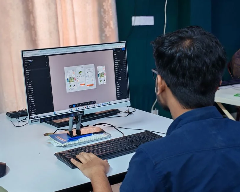

A React Native UI Kit is a collection of pre-built, reusable user interface components designed to accelerate cross-platform mobile application development. These kits provide standardized, performant, and often themable elements such as buttons, cards, forms, and navigation bars, allowing developers to construct consistent user experiences efficiently across iOS and Android from a single codebase. Their adoption directly impacts development velocity, code maintainability, and the overall architectural robustness of a React Native application.
Recent advancements in React Native UI Kits emphasize modularity, accessibility, and deep integration with design systems, reflecting a broader industry trend towards component-driven development and improved developer experience. This evolution is particularly relevant for cloud-native architectures where rapid iteration and consistent user interfaces are paramount. Selecting and integrating the right UI kit is not merely a design decision; it is an architectural commitment with significant implications for performance, scalability, and long-term operational costs.
Understanding React Native UI Kits in a Cloud Architecture Context
React Native UI Kits are foundational elements that abstract away the complexities of native UI implementation, offering a consistent layer for presenting information and receiving user input. From a cloud architect’s perspective, these kits are not just visual assets; they are critical dependencies that influence application bundle size, build times, runtime performance, and ultimately, the user experience delivered from your cloud infrastructure. A well-chosen UI kit minimizes the need for custom component development, reducing technical debt and allowing engineering teams to focus on core business logic and backend integrations.
The primary value proposition of a UI kit lies in its ability to provide a consistent visual language and interaction model across an application, or even an entire suite of applications. This consistency is crucial for branding and user trust. Architecturally, it means that the frontend rendering layer is standardized, which simplifies testing, debugging, and future feature development. When considering deployment to a cloud environment, a lighter, more optimized UI kit can translate into smaller application bundles, faster over-the-air updates, and reduced data transfer costs for end-users, especially in regions with limited bandwidth.
Furthermore, the choice of a UI kit can impact the ease with which an application integrates with backend services. Components often need to display data fetched from REST APIs or GraphQL endpoints. The structure and flexibility of a UI kit’s components dictate how easily this data can be consumed and rendered. For instance, a robust table component within a UI kit might seamlessly handle pagination, sorting, and filtering operations, offloading these complexities from individual feature teams and ensuring a uniform data presentation layer across the application. This architectural consistency is vital for maintaining a clean separation of concerns between the UI layer and the data access layer, a principle that aligns with robust cloud-native application design.
The decision to adopt a specific UI kit should therefore be made with a full understanding of its underlying implementation, its dependencies, and its potential impact on the CI/CD pipeline. Kits that rely on complex native modules can increase build times and introduce platform-specific issues, requiring more sophisticated build environments and potentially longer deployment cycles. Conversely, kits built predominantly with JavaScript components tend to be more portable and easier to integrate into existing React Native projects, simplifying the continuous delivery process and accelerating time-to-market for new features or bug fixes. This holistic view is essential for any cloud architect evaluating frontend technology choices.
The Role of Component Libraries in System Design
Component libraries, often synonymous with UI Kits in React Native, are fundamental to modern system design. They provide a single source of truth for UI elements, ensuring visual and functional consistency across disparate parts of an application or even across multiple applications within an enterprise ecosystem. From an architectural standpoint, this promotes a modular approach, allowing teams to build complex UIs by composing smaller, well-defined components. This modularity is a cornerstone of scalable software design, reducing cognitive load for developers and accelerating feature delivery.
When integrating a UI kit, architects must consider how it aligns with existing design systems and branding guidelines. Many UI kits offer extensive theming capabilities, allowing for deep customization without forking the library. This is crucial for maintaining upgrade paths and benefiting from upstream bug fixes and performance improvements. Theming often involves a centralized configuration, which can be managed as part of the application’s overall configuration-as-code strategy, ensuring that UI styles are version-controlled and deployed consistently across environments. This approach simplifies the management of visual assets and ensures that design changes can be propagated efficiently.
Another key aspect is the kit’s accessibility features. Ensuring that an application is accessible to all users, including those with disabilities, is a non-negotiable requirement for many enterprise applications. A high-quality UI kit will inherently provide accessible components, adhering to WCAG standards and offering proper ARIA attributes and keyboard navigation. This not only fulfills compliance requirements but also expands the application’s user base. From an operational perspective, relying on a UI kit for accessibility means that individual development teams do not need to re-implement these complex features, reducing the risk of accessibility bugs and streamlining the testing process. This contributes to a more reliable and inclusive application, a critical consideration for any architect.
Impact on Deployment Strategies and Cloud Resource Allocation
The choice of a React Native UI kit significantly influences deployment strategies and subsequent cloud resource allocation. A UI kit, particularly one with a rich set of features and dependencies, can considerably increase the application’s bundle size. Larger bundles require more time for compilation, packaging, and distribution through app stores or internal deployment mechanisms. For cloud-based CI/CD pipelines, this translates directly to longer build times, consuming more compute resources (CPU, memory) on build servers or containerized build agents. Organizations leveraging services like AWS CodeBuild or GCP Cloud Build will see an increase in billing associated with build duration and resource utilization.
Furthermore, larger application binaries can impact download times for end-users, especially those on slower network connections. While not directly a cloud resource cost, slow downloads can lead to user abandonment, affecting business metrics. Optimizing the UI kit’s footprint, through tree-shaking or selective component imports, becomes a critical task for architects aiming for lean deployments. This optimization effort itself requires developer time and potentially specialized tooling, which are indirect costs. When deploying updates, particularly over-the-air (OTA) updates using platforms like CodePush, smaller delta bundles derived from an optimized UI kit ensure faster updates and a smoother user experience, reducing the load on content delivery networks (CDNs) if used for OTA asset distribution.
Consider the implications for serverless backend architectures. While React Native is primarily a client-side technology, its development lifecycle is often intertwined with serverless functions for API endpoints, authentication, or image processing. Faster frontend deployments, facilitated by efficient UI kits, mean that new features can be rolled out more quickly, allowing for rapid iteration and A/B testing of UI changes. This agility directly benefits from the streamlined development process enabled by a comprehensive UI kit. The overall velocity of the development team, enhanced by reusable components, indirectly reduces the operational burden on backend teams, as they receive fewer requests for minor UI-related data adjustments, allowing them to focus on core service development.
Optimizing Build Pipelines with UI Kits
Integrating a UI kit into a CI/CD pipeline requires careful consideration to maintain efficiency. The initial setup involves installing the UI kit’s dependencies, which can be substantial. Caching these dependencies in the build environment is a standard practice to reduce subsequent build times. For example, in a Dockerized CI/CD setup, a multi-stage build can be used to cache node modules. This ensures that only the application-specific code changes trigger a full re-installation of dependencies, saving valuable build minutes.
# Stage 1: Install dependencies and cache them
FROM node:18-alpine AS dependency_builder
WORKDIR /app
COPY package.json yarn.lock ./
RUN yarn install --frozen-lockfile

# Stage 2: Build the React Native application
FROM node:18-alpine AS app_builder
WORKDIR /app
COPY --from=dependency_builder /app/node_modules ./node_modules
COPY . .
RUN yarn react-native bundle --platform android --dev false --entry-file index.js --bundle-output android/app/src/main/assets/index.android.bundle --assets-dest android/app/src/main/res/

# Stage 3: Final image (e.g., for release builds or further native compilation)
FROM openjdk:17-jdk-slim-buster
WORKDIR /app
COPY --from=app_builder /app/android ./android
# ... further native build steps for Android or iOS
This Dockerfile snippet demonstrates a multi-stage build pattern. The `dependency_builder` stage installs `node_modules` once, and these are then copied to the `app_builder` stage, avoiding repeated `yarn install` operations. This approach is fundamental for optimizing CI/CD costs when dealing with large dependency trees introduced by UI kits.
Furthermore, static analysis and linting tools should be integrated early in the pipeline to catch UI-related issues before they reach production. Tools like ESLint with React Native specific plugins can enforce coding standards and identify common pitfalls related to component usage. This proactive approach reduces the feedback loop for developers and prevents costly regressions. Automated UI testing frameworks, such as Detox or Appium, can also be used to validate the correct rendering and interaction of UI kit components across different device configurations, providing an additional layer of quality assurance before deployment to staging or production environments.
The impact of UI kits on cloud resource allocation extends to analytics and monitoring. Applications built with UI kits often generate a significant volume of UI interaction events. Architects must ensure that the chosen analytics platform can ingest and process this data efficiently without incurring excessive costs. Proper event filtering and aggregation at the client-side, combined with efficient data transmission protocols, can mitigate these concerns. This holistic view of the development and operational lifecycle is essential for any cloud architect.
Performance Optimization: Mitigating UI Kit Overhead
While React Native UI kits offer significant development speed advantages, they can introduce performance overhead if not managed carefully. The primary concerns revolve around bundle size, rendering performance, and memory consumption. A common pitfall is importing entire UI kits when only a fraction of their components are used. This leads to ‘dead code’ being included in the final application bundle, increasing its size and parsing time. Architects must enforce modular imports, ensuring that only necessary components are bundled. Many modern UI kits support this out-of-the-box, allowing developers to import individual components rather than the whole library.
For instance, instead of `import { Button, Card } from ‘my-ui-kit’;`, a more optimized approach might be `import Button from ‘my-ui-kit/components/Button’; import Card from ‘my-ui-kit/components/Card’;` This granular control allows bundlers like Metro to perform more effective tree-shaking, eliminating unused code paths. Furthermore, code splitting, though more challenging in React Native than in web environments, can be explored for specific scenarios where large, infrequently used sections of the UI kit can be loaded on demand. This requires careful architectural planning to manage dynamic imports and ensure a smooth user experience.
Rendering performance is another critical area. Complex UI kit components, especially those with intricate animations or deep component trees, can lead to slow frame rates if not optimized. Architects should encourage the use of React Native’s `PureComponent` or `React.memo` for functional components to prevent unnecessary re-renders. Profiling tools, such as the React Native Debugger’s profiler or Flipper, are indispensable for identifying rendering bottlenecks within UI kit components. These tools can pinpoint components that re-render too frequently or take excessive time to mount, guiding optimization efforts. For highly dynamic lists, `FlatList` or `SectionList` components should be used, often with custom `getItemLayout` and `windowSize` props to optimize rendering of large datasets, ensuring that UI kit elements within these lists perform efficiently.
Memory Management and Native Module Considerations
Memory consumption is another often-overlooked aspect. UI kits, particularly those that wrap native modules or use complex JavaScript objects for styling and state, can contribute to increased memory footprint. This is especially critical on lower-end devices or when running multiple applications concurrently. Architects should monitor memory usage during development and testing using tools like Xcode’s Instruments or Android Studio’s Memory Profiler. Identifying memory leaks or excessive allocations related to UI kit components is key to maintaining application stability and responsiveness.
Some UI kits leverage native modules for performance-critical components (e.g., complex animations, gesture handling). While these can offer superior performance, they also introduce platform-specific dependencies and potential build complexities. When selecting a UI kit, evaluate its reliance on native modules. If a significant portion of the kit is native, ensure that your team has the expertise to manage native module linking, debugging, and versioning across iOS and Android. This often involves a deeper understanding of Xcode and Android Studio environments, which can increase the operational overhead. For applications where a lean bundle and minimal native dependencies are paramount, prioritizing JavaScript-based UI kits might be a more prudent architectural decision.
Finally, the interplay between the UI kit and the application’s overall state management solution (e.g., Redux, Zustand, React Context) must be considered. Inefficient state updates that trigger widespread re-renders of UI kit components can severely degrade performance. Architects should design state management flows to minimize unnecessary prop changes to UI kit components, using selectors or memoized values where appropriate. This careful orchestration of state and UI rendering is fundamental to achieving high-performance React Native applications, even when relying heavily on third-party UI kits. A well-structured React Root Component can be instrumental in managing global state and ensuring efficient prop distribution to UI kit elements.
Maintainability, Upgrades, and Design System Governance
The adoption of a React Native UI kit brings both advantages and challenges regarding application maintainability and governance. On the positive side, a well-maintained UI kit provides a stable API for UI components, reducing the amount of custom code that needs to be written and maintained. This standardization can significantly lower technical debt and simplify onboarding for new developers, as they can quickly become productive by leveraging pre-built components that adhere to established design patterns. However, the external dependency on a UI kit also means that architectural decisions must account for its lifecycle, upgrade paths, and potential breaking changes.
Upgrading UI kits can be a non-trivial process, especially for kits with frequent releases or those that introduce significant API changes. Architects must plan for these upgrades, allocating dedicated time and resources. A robust testing suite, including unit, integration, and UI tests, is crucial for validating that upgrades do not introduce regressions. Adopting semantic versioning and carefully reviewing release notes for breaking changes are essential practices. In some cases, it might be necessary to temporarily fork a component or create wrapper components to insulate the application from specific breaking changes, allowing for a phased migration. This strategy helps maintain application stability while still benefiting from upstream improvements.
Integrating a UI kit effectively means aligning it with an overarching design system. A design system serves as the single source of truth for design principles, patterns, and components, ensuring visual and functional consistency across all products. The UI kit becomes the technical implementation of the design system’s component library. Architects play a vital role in ensuring this alignment. They must evaluate whether the chosen UI kit is flexible enough to implement the design system’s specifications without requiring extensive overrides or custom component development. Excessive customization of UI kit components can negate the benefits of using a kit, leading to higher maintenance costs and making future upgrades more difficult.
Version Control and Collaborative Development
For large engineering teams, managing the UI kit dependency within a monorepo or multi-repo setup requires careful version control strategies. Pinning specific versions of the UI kit and using lock files (e.g., `yarn.lock`, `package-lock.json`) is standard practice to ensure build reproducibility. However, for internal UI kits or custom components built on top of an external kit, more sophisticated versioning and publishing strategies are needed. This might involve creating a separate package for the custom components and publishing it to a private npm registry, allowing different applications to consume it independently.
{
  "name": "@my-company/custom-ui-components",
  "version": "1.0.0",
  "description": "Custom UI components built on top of a base React Native UI Kit.",
  "main": "lib/index.js",
  "scripts": {
    "build": "babel src --out-dir lib",
    "prepublishOnly": "yarn build"
  },
  "dependencies": {
    "base-ui-kit": "^5.0.0",
    "react": "^18.2.0",
    "react-native": "^0.72.0"
  },
  "peerDependencies": {
    "react": ">=18.0.0",
    "react-native": ">=0.70.0"
  }
}
This `package.json` snippet illustrates how an internal package for custom UI components might declare its dependencies on a base UI kit and React Native. The `peerDependencies` ensure that the consuming application provides compatible versions of React and React Native, preventing dependency conflicts. This level of modularity is crucial for large-scale enterprise development, allowing for independent evolution of UI components while maintaining a consistent foundation. The strategic value in enterprise software development often lies in such well-governed component ecosystems.
Architects must also consider the governance model for design system evolution. Who approves new components? How are changes communicated? Establishing clear processes, perhaps through RFCs (Request for Comments) or ADRs (Architectural Decision Records), ensures that design and technical decisions related to the UI kit are well-documented and transparent. This collaborative approach fosters buy-in from both design and engineering teams, leading to a more cohesive and maintainable product. Ultimately, the long-term success of a React Native application heavily depends on how effectively its UI kit is managed throughout its lifecycle.
Integration with Backend Services: Data Flow and Component State Management
The seamless integration of a React Native UI kit with backend services is paramount for delivering dynamic, data-driven applications. From an architectural standpoint, the UI kit components are primarily responsible for presentation, while the application’s business logic orchestrates data fetching, state management, and interaction with APIs. Architects must ensure a clear separation of concerns, allowing UI components to be as ‘dumb’ or presentational as possible, receiving data via props and emitting events through callbacks.
When data is fetched from backend services, such as a REST API or a GraphQL endpoint, it typically flows through a data access layer before reaching the UI. This layer might use libraries like Axios, React Query, or Apollo Client to manage network requests, caching, and data normalization. The UI kit components then consume this normalized data. For example, a `DataTable` component from a UI kit might expect an array of objects, and it’s the application’s responsibility to transform the raw API response into this expected format. This transformation layer is critical for insulating the UI from changes in the backend API structure, enhancing resilience and maintainability.
Consider an application displaying a list of products. A `ProductCard` component from the UI kit would receive product details (name, price, image URL) as props. The data fetching logic, potentially residing in a custom hook or a Redux saga, would retrieve this data from an API endpoint, handle loading states, and propagate errors. The UI kit component itself should ideally not be concerned with *how* the data was fetched, but rather *how to display* the data it receives. This strict separation simplifies testing of both the UI and the data fetching logic independently.
Handling Asynchronous Operations and Loading States
Asynchronous operations are inherent in mobile applications that interact with backend services. UI kits often provide components for managing these states, such as `ActivityIndicator`, `Skeleton` loaders, or `ErrorDisplay` components. Architects should establish clear patterns for how these components are used across the application. For instance, a common pattern involves wrapping data-dependent components with a conditional renderer that displays a loading indicator until data is available, and an error message if the fetch fails.
import React from 'react';
import { View, ActivityIndicator, Text } from 'react-native';
import { Card } from 'my-ui-kit'; // Assuming Card is from a UI kit

const ProductDetail = ({ productId }) => {
  const { data: product, isLoading, isError, error } = useProduct(productId); // Custom hook for data fetching

  if (isLoading) {
    return (


        Loading product details...

    );
  }

  if (isError) {
    return (

        Error: {error.message}

    );
  }

  return (

      Price: ${product.price}
      Description: {product.description}

  );
};

export default ProductDetail;
This example demonstrates how a custom `useProduct` hook handles data fetching, and the `ProductDetail` component conditionally renders UI kit components (`ActivityIndicator`, `Text`, `Card`) based on the loading and error states. This pattern ensures a consistent user experience during data retrieval and error handling, which is critical for user retention and satisfaction.
When designing the data access layer, consider using tools like Next.js Prisma Client for robust data access in a backend context. While Prisma is not directly used in React Native, the principles of type-safe, efficient data retrieval from a well-defined schema are highly relevant. A React Native application would consume data exposed by a backend API that might itself be built using such tools, ensuring data integrity and consistency from the database to the mobile UI. The architectural goal is to create a predictable and resilient data flow, where UI kit components simply reflect the current state of the application’s data, regardless of its origin.
Finally, real-time updates from backend services, often facilitated by WebSockets or server-sent events, require UI kit components to react dynamically. Architects must ensure that the state management solution can efficiently propagate these updates to the relevant UI components, triggering minimal re-renders. This often involves memoization techniques and careful selection of data structures to prevent performance bottlenecks. The integration of UI kits with backend services is a core architectural concern, dictating both the application’s responsiveness and its long-term maintainability.
Security Posture: Evaluating Third-Party UI Kit Dependencies
Adopting any third-party library, including a React Native UI kit, introduces external dependencies that can impact the application’s security posture. From a cloud architect’s viewpoint, this is a critical area requiring rigorous evaluation. A compromised UI kit component could potentially expose sensitive user data, introduce vulnerabilities, or provide an attack vector for malicious actors. Therefore, due diligence is paramount in selecting and managing these dependencies throughout the application lifecycle.
The first step in evaluating a UI kit is to assess its provenance and maintenance status. Is the kit actively maintained by a reputable organization or a vibrant open-source community? Projects with consistent updates, clear security policies, and a history of promptly addressing reported vulnerabilities are generally preferable. Reviewing the kit’s GitHub repository for open issues, pull requests, and commit history can provide insights into its health and responsiveness. A stagnant or poorly maintained kit poses a higher risk, as security flaws might go unpatched.
Next, architects should scrutinize the kit’s direct and transitive dependencies. Modern JavaScript projects often have deep dependency trees, and a vulnerability in a seemingly innocuous sub-dependency can compromise the entire application. Tools like Snyk, OWASP Dependency-Check, or npm audit can scan the project’s `node_modules` for known vulnerabilities. Integrating these tools into the CI/CD pipeline ensures that security checks are performed automatically with every build, providing early warnings about potential risks. Remediation strategies might include upgrading the vulnerable dependency, finding an alternative, or, in rare cases, patching the dependency manually.
Data Handling and Permissions
Architects must also evaluate how UI kit components handle user input and display data. Components that process sensitive information, such as passwords, credit card numbers, or personal identifiable information (PII), must be designed with security in mind. This includes ensuring proper input validation, sanitization, and preventing common vulnerabilities like cross-site scripting (XSS), even though React Native mitigates some web-specific XSS risks. UI kit components should not store sensitive data unnecessarily in their internal state or pass it through insecure channels.
Permissions are another crucial aspect, particularly for native modules within a UI kit. If a UI kit component requires access to device features like the camera, microphone, or location services, architects must understand why these permissions are needed and ensure they align with the application’s functional requirements and privacy policy. Unnecessary permissions can be a red flag, indicating potential over-privileging or even malicious intent. Reviewing the `AndroidManifest.xml` (Android) and `Info.plist` (iOS) files for the final compiled application to verify requested permissions is an essential security practice.
Finally, consider the licensing of the UI kit. Open-source licenses vary widely, and some may have implications for commercial use or require specific attribution. While not directly a security concern, understanding the legal implications of using a third-party kit is part of a comprehensive architectural review. For enterprise applications, commercial UI kits often come with support contracts and indemnification, which can offer an additional layer of security assurance, though at a higher cost. The overall security posture of a React Native application is a sum of its parts, and third-party UI kits represent a significant and often overlooked vector that demands constant vigilance.
Choosing the Right React Native UI Kit: A Pragmatic Architectural Guide
Selecting the appropriate React Native UI kit is a decision with long-term architectural implications, extending beyond mere aesthetics. A pragmatic approach involves evaluating kits based on criteria that align with project requirements, team expertise, and operational sustainability. The goal is to find a kit that accelerates development without introducing undue technical debt or performance bottlenecks. This involves a careful balance of features, flexibility, and community support.
First, assess the **architectural fit** with your project’s needs. Does the UI kit support the platforms you target (iOS, Android, web, desktop)? Does it align with your preferred styling approach (e.g., styled-components, Tailwind CSS, native styling)? Some kits offer highly opinionated styling, which can be great for rapid development but restrictive for custom branding. Others provide more flexibility through theming APIs or direct style prop overrides. Consider whether the kit’s component API is intuitive and consistent, promoting good coding practices and maintainability. A well-designed API reduces the learning curve for developers and minimizes the likelihood of misusing components.
Second, evaluate **community support and maintenance**. A vibrant open-source community or a dedicated commercial team ensures that the UI kit is actively maintained, bugs are addressed, and new features are added. Check the frequency of releases, the number of contributors, and the responsiveness to issues on platforms like GitHub. A strong community often translates to better documentation, more examples, and a larger pool of knowledge for troubleshooting. For commercial kits, investigate the level of support offered, including SLAs and direct communication channels. This is particularly important for enterprise applications where stability and timely issue resolution are critical.
Third, **performance characteristics** are paramount. As discussed previously, bundle size, rendering efficiency, and memory footprint vary significantly between kits. Look for kits that emphasize performance optimization, offer tree-shaking support, and avoid unnecessary native dependencies unless explicitly required for specific features. Some kits might be optimized for specific use cases (e.g., data-heavy applications, animation-rich experiences), so align your choice with your application’s primary performance demands. Conduct preliminary performance tests with a small prototype using shortlisted kits to gather empirical data.
Licensing, Customization, and Future-Proofing
Fourth, **licensing terms** must be thoroughly reviewed. Open-source licenses (MIT, Apache, GPL) have different implications for commercial projects. Some commercial kits require per-developer or per-application licenses, which can impact project costs. Ensure that the chosen license aligns with your legal and compliance requirements. Misunderstanding licensing terms can lead to significant legal complications down the line.
Fifth, consider the **customization and theming capabilities**. Can the UI kit be easily adapted to your specific design system and brand guidelines without resorting to extensive overrides or monkey-patching? A good UI kit provides a clear theming API, allowing you to define colors, typography, spacing, and component variants centrally. This ensures consistency and simplifies design updates across the application. Kits that are too rigid in their styling can become a hindrance, forcing developers to fight against the library rather than leverage it.
Finally, think about **future-proofing**. How well does the UI kit keep up with new React Native versions and ecosystem changes? Does it have a clear roadmap? Kits that are slow to adapt to new React Native features or deprecations can lead to compatibility issues and force costly migrations. Prioritize kits that demonstrate a commitment to staying current with the evolving React Native landscape. A comprehensive evaluation matrix, weighing these factors against your project’s specific needs, is an invaluable tool for making an informed architectural decision.
| Evaluation Criterion | Description | Impact on Project |
|---|---|---|
| Architectural Fit | Alignment with project structure, styling, and platform targets. | Development speed, maintainability, code quality. |
| Community/Support | Activity, documentation, issue resolution, commercial support. | Long-term viability, troubleshooting efficiency. |
| Performance | Bundle size, rendering speed, memory footprint, native dependencies. | User experience, cloud resource costs, device compatibility. |
| Licensing | Legal terms for usage in commercial or open-source projects. | Legal compliance, intellectual property rights. |
| Customization | Theming capabilities, ease of adapting to design system. | Brand consistency, design flexibility, upgrade path. |
| Future-Proofing | Compatibility with new React Native versions, clear roadmap. | Reduced migration costs, access to new features. |
Customization and Theming: Balancing Flexibility with Maintainability
Customizing and theming a React Native UI kit is a critical aspect of establishing a distinct brand identity while leveraging the efficiency of pre-built components. From an architectural perspective, the challenge lies in striking a balance: achieving the desired visual and functional uniqueness without creating a maintenance nightmare. Overriding core styles or behaviors of a UI kit can quickly lead to an unmanageable codebase, making future upgrades difficult and potentially introducing unexpected visual regressions.
Most mature React Native UI kits offer a robust theming API. This API typically allows developers to define a central theme object, which includes colors, typography scales, spacing units, border radii, and even component-specific variants. This theme object is then provided to the entire application, usually through a React Context Provider. Components from the UI kit automatically consume these theme values, ensuring consistency across the application. This approach is highly recommended as it centralizes design tokens and promotes a single source of truth for styling, aligning perfectly with design system principles.
// theme.js
export const MyTheme = {
  colors: {
    primary: '#1a73e8',
    secondary: '#e8451a',
    background: '#f5f5f5',
    text: '#333333',
    // ... other colors
  },
  typography: {
    h1: { fontSize: 32, fontWeight: 'bold' },
    body: { fontSize: 16, lineHeight: 24 },
    // ... other text styles
  },
  spacing: {
    xs: 4,
    sm: 8,
    md: 16,
    lg: 24,
    // ... other spacing values
  },
  components: {
    Button: {
      variants: {
        primary: { backgroundColor: MyTheme.colors.primary, color: 'white' },
        secondary: { backgroundColor: MyTheme.colors.secondary, color: 'white' }
      },
      defaultProps: { size: 'md' }
    }
  }
};

// App.js (or Root Component)
import React from 'react';
import { ThemeProvider } from 'my-ui-kit'; // Assuming the UI kit provides a ThemeProvider
import { MyTheme } from './theme';
import HomeScreen from './HomeScreen';

const App = () => {
  return (


  );
};

export default App;
This example demonstrates a typical theming setup. The `MyTheme` object centralizes all design tokens, and the `ThemeProvider` makes these values available to all child components. When a UI kit component like `Button` is used, it can automatically pick up styles defined in `MyTheme.components.Button` or use the global color palette. This method ensures that design changes can be implemented globally by modifying a single theme file, rather than searching and replacing styles throughout the codebase.
Component Overrides and Wrapper Components
While theming is powerful, there are instances where specific components might need more granular customization that goes beyond the theming API. Most UI kits provide mechanisms for component overrides, allowing developers to replace a sub-component or modify its props. However, this should be approached with caution. Excessive overrides can tightly couple your application to the internal structure of the UI kit, making future upgrades more challenging if the kit’s internal component hierarchy changes.
A safer architectural pattern for significant customization is to create **wrapper components**. Instead of directly overriding a UI kit component, you create your own component that wraps the UI kit component, applying custom styles or logic. This creates an abstraction layer, insulating your application from direct changes to the UI kit. For example, if a `Card` component from a UI kit doesn’t fully meet your design requirements, you can create a `CustomAppCard` component that renders the UI kit’s `Card` and applies additional styling or adds custom children. This keeps your application’s unique components separate from the base UI kit, making it easier to manage dependencies and upgrades.
Architects should also consider the impact of customization on accessibility. When overriding styles or behaviors, ensure that accessibility standards are still met. Customizing interactive elements, in particular, requires careful testing to ensure they remain usable for users with disabilities. Maintaining a clean separation between the base UI kit and your application’s specific customizations is key to long-term maintainability. This ensures that you can continue to benefit from the UI kit’s updates and improvements while still delivering a unique and branded user experience. The goal is to maximize reusability and consistency, minimizing the need for bespoke solutions that are costly to build and maintain.
CI/CD Pipeline Integration: Streamlining Development with UI Kits
Integrating a React Native UI kit into a Continuous Integration/Continuous Delivery (CI/CD) pipeline is fundamental for maintaining development velocity, ensuring code quality, and enabling rapid, reliable deployments. From a cloud architect’s perspective, the pipeline must be robust enough to handle the UI kit’s dependencies, build processes, and testing requirements efficiently, minimizing build times and maximizing developer feedback loops. A well-orchestrated CI/CD pipeline transforms the benefits of a UI kit into tangible operational advantages.
The initial phase of CI involves dependency management. As UI kits can have extensive dependency trees, caching `node_modules` is a critical optimization. Cloud CI/CD services like GitHub Actions, GitLab CI/CD, or Azure Pipelines offer mechanisms for caching build artifacts, significantly reducing the time spent on `npm install` or `yarn install` in subsequent builds. This ensures that only changes to `package.json` or `yarn.lock` trigger a full dependency re-installation, saving valuable compute resources and accelerating feedback cycles.
# Example GitHub Actions workflow snippet for caching
name: React Native CI
on:
  push:
    branches:
      - main
jobs:
  build:
    runs-on: ubuntu-latest
    steps:
      - uses: actions/checkout@v3
      - name: Cache node modules
        uses: actions/cache@v3
        with:
          path: ~/.yarn
          key: ${{ runner.os }}-yarn-${{ hashFiles('**/yarn.lock') }}
          restore-keys:
            ${{ runner.os }}-yarn-
      - name: Install dependencies
        run: yarn install --frozen-lockfile
      - name: Run ESLint
        run: yarn lint
      - name: Run tests
        run: yarn test
      # ... further build steps for Android/iOS
This YAML snippet illustrates how `actions/cache` can be used in GitHub Actions to cache Yarn dependencies. This is a standard practice for optimizing CI/CD pipelines when dealing with large JavaScript dependency sets, common with comprehensive UI kits.
Automated Testing and Code Quality Gates
Automated testing is non-negotiable for applications using UI kits. Unit tests for individual components, integration tests for component compositions, and end-to-end (E2E) UI tests are essential. Tools like Jest for unit and integration testing, and Detox or Appium for E2E tests, should be integrated into the pipeline. These tests ensure that UI kit components render correctly, respond to user interactions as expected, and do not introduce regressions after code changes or UI kit upgrades. Failing tests should act as mandatory quality gates, preventing faulty code from progressing further in the pipeline.
Code quality checks, such as linting (ESLint) and static analysis, are equally important. These tools enforce coding standards, identify potential bugs, and ensure consistency in how UI kit components are used. Architectures should configure these tools to run early in the CI pipeline, ideally as a pre-commit hook or before tests, to provide immediate feedback to developers. This proactive approach reduces the cost of fixing defects later in the development cycle. Furthermore, accessibility checks, either automated or semi-automated, can be integrated to ensure that UI kit usage adheres to accessibility guidelines, a crucial aspect for inclusive application design.
For the CD portion, the pipeline should automate the packaging and signing of React Native applications for both iOS and Android. This involves generating production-ready bundles, compiling native code, and signing the application with appropriate certificates. Cloud services like App Center, Bitrise, or Fastlane can automate these complex steps, integrating seamlessly with your chosen UI kit. The ultimate goal is to achieve a fully automated delivery process, from code commit to application store submission or internal distribution, ensuring that new features and bug fixes, often leveraging UI kit components, can be deployed rapidly and reliably to end-users.
Cost Implications of React Native UI Kit Adoption
The adoption of a React Native UI kit carries significant cost implications that extend beyond initial licensing fees, encompassing developer velocity, long-term maintenance, and operational overhead. From a cloud architect’s perspective, these costs are primarily driven by the efficiency of development teams and the stability of the deployed application, both of which are directly influenced by the UI kit choice. Understanding these cost vectors is crucial for a realistic total cost of ownership (TCO) assessment.
1. Developer Time and Productivity: This is arguably the largest cost factor. A well-chosen UI kit significantly boosts developer productivity by providing ready-to-use components. If a UI kit saves 20% of a developer’s time on UI-related tasks, this translates directly into salary savings or accelerated feature delivery. Conversely, a poorly chosen or overly complex kit can impede development, leading to increased developer hours. For a team of 5 developers earning an average of $60/hour, saving just 10 hours per week per developer amounts to $3,000 in savings weekly, or approximately $156,000 annually. This is a substantial hidden cost or saving.
2. Licensing Fees: While many React Native UI kits are open-source (e.g., NativeBase, React Native Paper), some commercial options exist (e.g., UI Kitten Pro, certain premium component libraries). These typically involve per-developer or per-project annual subscriptions. For instance, a premium UI kit might cost between $500 to $2,000 per developer per year, or a one-time project license could range from $3,000 to $10,000. These direct costs must be factored into the budget, especially for larger teams or multiple projects.
3. Maintenance and Upgrades: UI kits evolve, and keeping them updated is essential for security, performance, and compatibility with new React Native versions. The cost of maintenance includes developer hours spent on: reviewing release notes, testing for regressions, fixing breaking changes, and potentially refactoring application code. For a medium-sized application, allocating 2-4 developer days per quarter for UI kit maintenance is a reasonable estimate, costing approximately $1,000 to $2,000 per quarter in developer salaries. If the kit requires extensive custom overrides, this cost can escalate significantly.
4. Learning Curve and Onboarding: Every new library introduces a learning curve. While UI kits generally simplify development, new team members still need to understand the kit’s API, theming system, and best practices. Initial onboarding might require 1-3 days of dedicated learning per new developer, incurring a cost of $500 to $1,500 per new hire in lost productivity. This is amortized over the project’s lifetime but is a real initial investment.
5. Performance Optimization Efforts: As discussed, UI kits can introduce performance overhead. Mitigating this requires developer effort for tree-shaking, modular imports, and profiling. This optimization work is a direct cost, potentially requiring 1-2 weeks of focused effort ($2,400 to $4,800) during critical development phases or after initial performance bottlenecks are identified. This cost is higher for complex kits or applications with stringent performance requirements.
6. Cloud Infrastructure Costs (Indirect): While not a direct UI kit cost, the kit’s impact on bundle size and build times indirectly affects cloud infrastructure. Longer build times consume more CI/CD minutes on platforms like AWS CodeBuild or GitHub Actions. A build that takes 10 minutes instead of 5 minutes, if run 50 times a day, can add up. For example, AWS CodeBuild’s `build.general1.small` instance (3GB memory, 2 vCPU) costs around $0.005/minute. An extra 5 minutes per build for 50 builds/day costs $1.25/day or $37.50/month. While seemingly small, these micro-costs accumulate across multiple projects and teams. Larger bundle sizes also affect CDN costs if assets are distributed globally, albeit negligibly for most mobile app scenarios.
| Cost Category | Description | Estimated Annual Cost (Example) |
|---|---|---|
| Developer Productivity | Time saved/lost due to kit efficiency. | $100,000 – $200,000 (savings or loss) |
| Licensing (Commercial) | Annual fees per developer/project. | $500 – $10,000 |
| Maintenance & Upgrades | Developer effort for updates, bug fixes. | $4,000 – $8,000 |
| Learning Curve | Time for new hires to learn the kit. | $500 – $1,500 per new developer |
| Performance Optimization | Effort to mitigate kit-related overhead. | $2,400 – $4,800 (as needed) |
| CI/CD & Cloud (Indirect) | Increased build times, bandwidth. | $500 – $2,000 (depending on scale) |
The typical range for the total annual cost impact of a React Native UI kit can therefore vary dramatically, from significant savings in developer time for well-chosen open-source kits, to an additional $10,000 to $30,000+ per year in direct and indirect costs for complex commercial kits or poorly managed open-source ones, not including the potential for lost revenue due to poor user experience from performance issues. A thorough cost-benefit analysis, considering these factors, is essential before making an architectural commitment to a specific UI kit.
Observability and Monitoring: Tracking UI Kit Performance in Production
Once a React Native application, heavily relying on a UI kit, is deployed to production, establishing robust observability and monitoring is paramount. From a cloud architect’s perspective, this involves instrumenting the application to gather data on UI performance, user interactions, and error rates, providing critical insights into the real-world behavior of the UI kit components. Without this visibility, identifying bottlenecks, regressions, or user experience issues related to the UI can become a reactive and costly process.
The first layer of observability involves **Application Performance Monitoring (APM)**. Tools like Sentry, Firebase Performance Monitoring, Datadog RUM (Real User Monitoring), or New Relic Mobile can be integrated to track key metrics such as application launch time, screen rendering times, network request durations, and crash rates. These tools can often provide granular insights into individual component rendering performance, allowing architects to pinpoint if a specific UI kit component is consistently causing slowdowns or excessive re-renders in production environments. For instance, if a complex `DataTable` component from a UI kit is showing high render times on certain devices, it indicates a need for optimization or a re-evaluation of its usage.
Beyond general APM, specific attention should be paid to **UI interaction tracking**. Analytics platforms like Google Analytics for Firebase, Amplitude, or Mixpanel can be used to log user interactions with UI kit components. Tracking events such as ‘button_click’, ‘tab_selected’, or ‘form_submission’ provides quantitative data on how users navigate and engage with the UI. This data can reveal if certain UI flows are confusing, if specific components are rarely used, or if there are unexpected user behaviors. For example, if a custom `Stepper` component from your UI kit shows a high rate of uncompleted interactions, it might indicate a usability issue or a bug that needs addressing.
Error Tracking and Crash Reporting
Effective **error tracking and crash reporting** are critical. UI kit components, especially those with complex logic or native dependencies, can be sources of runtime errors or crashes. Integrating services like Sentry or Crashlytics allows for real-time aggregation and analysis of these issues. These tools provide stack traces, device information, and user context, helping developers quickly diagnose and resolve problems. Architects should configure these services to capture relevant metadata, such as the UI kit version in use, to correlate errors with specific library versions. This is invaluable during UI kit upgrades or when rolling out new features.
For example, if a new version of a UI kit introduces a breaking change that causes a specific `DatePicker` component to crash on Android devices, a robust error tracking system will immediately flag this, providing the necessary details to roll back the change or deploy a hotfix. This proactive approach minimizes user impact and reduces the mean time to recovery (MTTR), a critical metric for operational excellence in cloud-native applications.
Finally, **custom logging and metrics** within the application can provide deeper insights into UI kit behavior. Developers can instrument specific UI kit components to log performance metrics (e.g., render duration of a list with X items, memory usage after mounting a complex modal). These custom metrics can then be pushed to a centralized logging system (e.g., AWS CloudWatch Logs, Google Cloud Logging) and visualized in dashboards (e.g., Grafana, Datadog). This granular visibility allows architects to define custom alerts for performance degradation or unusual behavior related to UI components, ensuring that the application remains performant and reliable under various production loads. Observability is not just about collecting data; it’s about transforming that data into actionable intelligence to maintain a superior user experience.
Future Trends: Adaptive UI and AI-Assisted Development
The landscape of React Native UI kits is continuously evolving, driven by advancements in mobile technology, design paradigms, and artificial intelligence. From a cloud architect’s perspective, understanding these future trends is crucial for making forward-looking decisions that ensure the long-term viability and adaptability of applications. The trajectory points towards more intelligent, adaptive, and developer-friendly UI component ecosystems.
One significant trend is **adaptive UI and responsive design**. While React Native inherently supports cross-platform development, future UI kits will likely offer more sophisticated mechanisms for adapting interfaces not just between iOS and Android, but also across various device form factors (phones, tablets, foldables, even smartwatches) and dynamic user preferences (dark mode, accessibility settings). This means UI kit components will become even more context-aware, intelligently adjusting layouts, typography, and interaction patterns based on available screen real estate, input methods, and user needs. Architects will need to design applications that can gracefully handle these dynamic adaptations, potentially leveraging new React Native APIs or external libraries that abstract away device-specific UI logic.
Another emerging area is **AI-assisted UI development**. Tools are beginning to emerge that can generate UI code from design mockups or even suggest component compositions based on user stories. While still in nascent stages, the integration of AI into UI kit ecosystems could revolutionize how components are assembled and customized. Imagine a tool that analyzes your design system and automatically configures a UI kit’s theme, or suggests optimal component layouts based on user behavior analytics. For architects, this could mean even faster prototyping cycles and reduced manual effort in translating design to code, allowing teams to focus on more complex business logic and backend integrations. This shift could further accelerate development velocity, driving down the cost of UI implementation.
Server-Driven UI and Cross-Platform Consistency
The concept of **server-driven UI (SDUI)** is gaining traction, and its influence on React Native UI kits will be profound. SDUI allows the backend to dictate the structure and content of the UI, sending a JSON payload that describes the components to be rendered and their properties. The frontend, equipped with a universal UI kit, then renders these components dynamically. This approach offers unparalleled flexibility, allowing for real-time UI updates, A/B testing of different layouts, and personalized user experiences without requiring a new app store deployment. Future UI kits will need to be highly adaptable to this paradigm, providing generic, configurable components that can be easily controlled by a backend schema.
Achieving true **cross-platform consistency, including web and desktop**, remains a goal. While React Native for Web and projects like Electron for desktop provide avenues, maintaining a unified UI kit across all these surfaces is challenging. Future UI kits will strive for more seamless integration, offering components that are truly universal and performant across diverse environments. This could involve deeper integration with web-specific styling solutions or native desktop UI frameworks, presenting a single, cohesive component API to developers regardless of the target platform. Architects will play a pivotal role in selecting kits that support this expansive vision, ensuring that the initial investment in a React Native UI kit yields benefits across the entire digital product ecosystem.
Finally, expect continued emphasis on **performance and bundle size optimization**. As mobile devices become more powerful, user expectations for fluid, instant experiences also increase. UI kits will incorporate more advanced techniques for lazy loading, granular re-rendering control, and even compile-time optimizations to reduce their footprint and enhance runtime performance. This continuous drive for efficiency will ensure that React Native applications, powered by sophisticated UI kits, can deliver cutting-edge user experiences while remaining operationally lean and cost-effective in cloud environments.
React Native UI kits are indispensable tools for modern cross-platform mobile development, offering significant advantages in development speed, consistency, and maintainability. However, their architectural implications extend deeply into performance, security, deployment, and long-term operational costs. A cloud architect’s role is to evaluate these kits holistically, considering not just their aesthetic appeal but their impact on the entire software lifecycle.
Pragmatic selection, meticulous integration into CI/CD pipelines, diligent performance optimization, and robust monitoring are critical for leveraging UI kits effectively. By understanding the trade-offs and proactively addressing potential challenges, organizations can harness the power of React Native UI kits to deliver high-quality, scalable, and cost-efficient mobile applications that meet both business objectives and user expectations.
Explore our complete Laravel, Basics directory for more guides.
NR Studio builds custom web apps, mobile apps, SaaS platforms, and internal tools for growing businesses. If you’re working through a technical decision, feel free to reach out — no commitment required.